


I would like to detail my most recent finished painting and my creative process here. I tried to document the various fazes of the paintings creation from the first sketch to the final stroke. I thought this would be a good thing to begin doing for myself with my paintings as a way to be able to step back from the creation process at intervals and really look at and critique what im creating…figure out what I like, don’t like and where I should go with the painting next. I thought I would be interesting to document the creation process on pieces since each painting is a completely different creative and spiritual journey for me. I learn something new with each piece I create.
Creative process- Step 1
My painting, as they often do, started out with a pen and ink drawing:
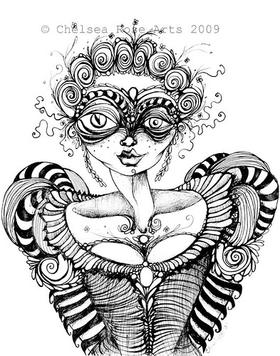
This illustration was done with my favorite drawing pens by Faber Castell. They are India ink pens that come in a variety of size from super fine to brush pen.
My pen and ink drawings usually happen spur of the moment. This drawing was inspired by lovely high busted, fancyfull dresses of the olden age when corsets and undoes were aplenty. I think I was watching the movie Sleepy hollow while I drew this, very much inspired by the costume design in the film…that especially of the white witch in the story. I have always had a fascination with tight waist corsetry and dresses and I find more and more I am doodling out my own gowns and gussied up ladies.
…I love pen and ink, black and white illustration. I am fond of this drawing as it is but I got to thinking I would like to try it on a larger scale using acrylic paint.
Creative process – Step 2
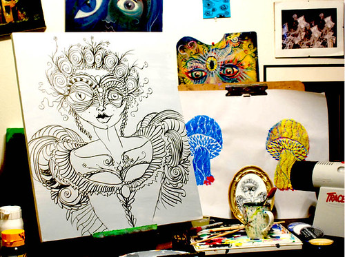
I started with a 24” x 24” studio framed blank canvas painted gray. I used my lil art projector called “tracer” and used one of my 5x7 prints as a base to project the illustration onto the canvas. I then very roughly traced over the projected image onto the canvas with my Faber Castell India Ink pens, until I had down the basic shape and detail of the drawing
Creative process – Step 3
Close up of color experimentation in detail on skin and face:
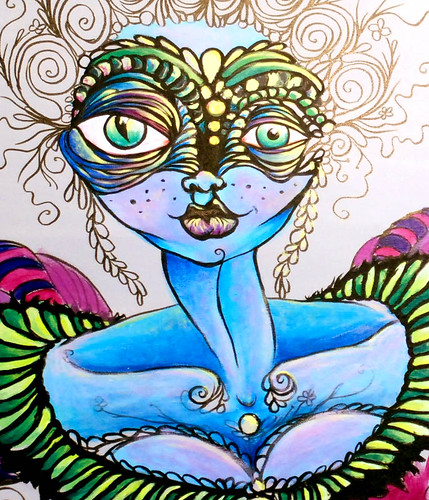
Next, I started experimenting with my colors. It may seem obvious but my favorite colors are Purple and green, especially when paired together. I find the color combo creates a unique color harmony that is hard for me to resist. Thus, I began to work out that the dress and the mask would be in those chosen colors. I often tend to paint the skin of my ladies a blue or a green, hinting at a paranormal aspect to these creatures( also indicated with the one eye that is in fact part “creature” be it cat or reptilian inspired with the sharp pupil)
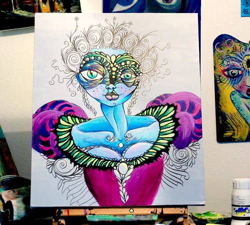
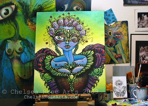
Creative Process -Step 4
Here I began coming in to detail and smooth out the first layers of color.
I went into the under eyes and pulled more purple in to compliment the dress. began adding color detail, high lighting along the sleeves and stuff... to give the dress a glow, then reapplied black to secure and smooth out the planned shapes. I decided on a yellow green gradation for the background...so far the background color just has its base foundation that will need to be enriched and smoothed later on. At this point I can really begin to see what direction the color palette is going and began plotting out things like what colors I might try to use in the hair and along the sleeves. Also realizing I will want to go back into the mask and repaint the right side so it’s a lil less clumsy lookin. At this point there is lots of room for experimentation.
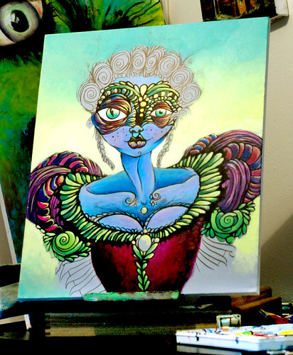
Creative Process – Step 5
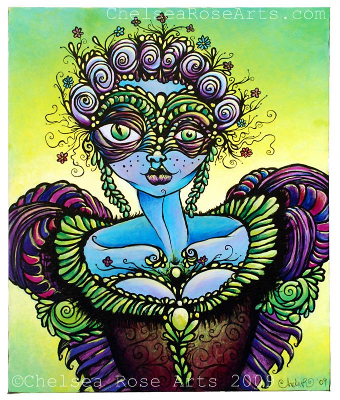
FINISHED!!
Please click to full View!
….i would have liked to document a few more phases with creating this piece before finishing it but it came together so fast I didn’t have time to stop at intervals and document. Firstly, I went back into the background and smoothed out the gradation...pulling more yellow into the mix and fanning it into a sorta green vignette around the sides. Once I did that I was able to make a firm decision on what color to make the hair. I wanted to go light, close to white even…to create a similar look of the old fashioned powdered wig type style. I chose to use the hair as a way to tie in some pink, that also is present in the delicate features of the face like the lips and the cheeks. I used a darker purple for shading, which helped compliment the color palette of the dress. I then went back into the corset and decided it was much too rough looking and needed some more highlight and a bit of interest. I did a few layers of green/yellow highlight and then began to layer the shine with a suggestion of spirally black brocade pattern…for the corsets fabric. I felt that added some interest and helped it look less flat. Once I got the corset finished and figured out I finished the lower pieces of sleeves along the arm, choosing the same colors used in the puffy striped parts of the upper sleeve. Once I was done with that I took some gray paint and whited out the right side of the mask just above her eye. I then went back in with black and planned the mask’s detail and shape better to compliment its other side. I then went in and did my base color work on it, trying to stick close to the colors already present in the mask. Once that was finished I went over the entire piece once again and accentuating a glowing look by adding more highlights in the details. When I was done with that all that was left to do was go back over the entire painting with black to smooth out the planned shapes and also to add the last pieces of detail, such as the wispys and flowers that spring from her head and the glowing jewels and flowers near her bosom. I did all that over this past weekend. I am very relieved to have this piece finished. Now all I have to do is sign, date it and varnish it. Once It is varnished I will take better, closer, more detailed pictures of it.
So, that’s that. I think I am going to try and paint smaller from now on since I am running out of room in my small apartment, and also it seems smaller paintings tend to be more sellable at the present since they tend to be less of an big investment.
P.S
Just incase someone was curious...I used a combination of Windsor and Newton Galleria acrylic paint and Daler Rowney system 3 acrylic paint.


That is a gorgeous pen and ink and a very vibrant painting. I knew right away what movie you'd been watching. Hahah. I can always tell a fellow Burton fan. I'll have to look into these pens you use. I'm always on the look out for new types to use in my illustrations. Love the circular frame too. I'd love to snag one of those at a thrift store.
ReplyDeleteThank you!
ReplyDeleteand....oh yes, these pens are great...but addictive. they come in Black, sepia and colors too. here is a link : http://www.dickblick.com/products/faber-castell-pitt-artist-pens/
they are great for detailed work.
....those frames were a lucky find, i cant seem to find anymore like em around town right now. but yes, i could see them going very well with your style of illustrations( which i love by the way, they are so whimsy!)