


I am doing my best to channel my Solstice/ New Year faery guide, The Master Maker who warns that in this new year creative problem solving is required of me and that I must do whatever I do as well as I can. And then make it even better. The Master Maker reminds me that my very best work is always desirable, and in the present situation, it is necessary for success.
So, over the holiday weekend I enjoyed using the time to work on projects:
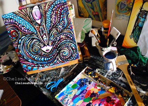
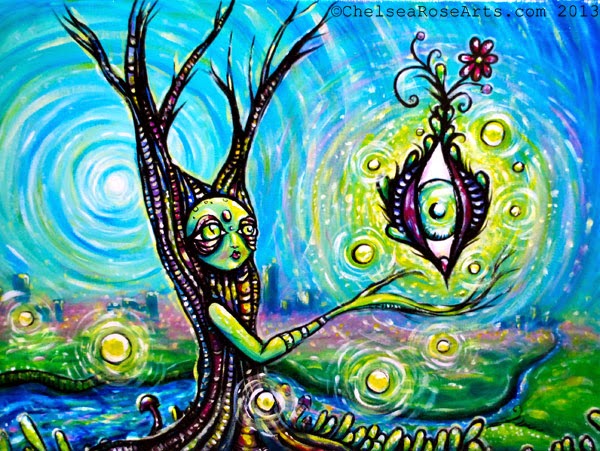
this is a 14" x 14" acrylic painting i am working on. May still change the direction of some of the coloring and shapes. We shall see!
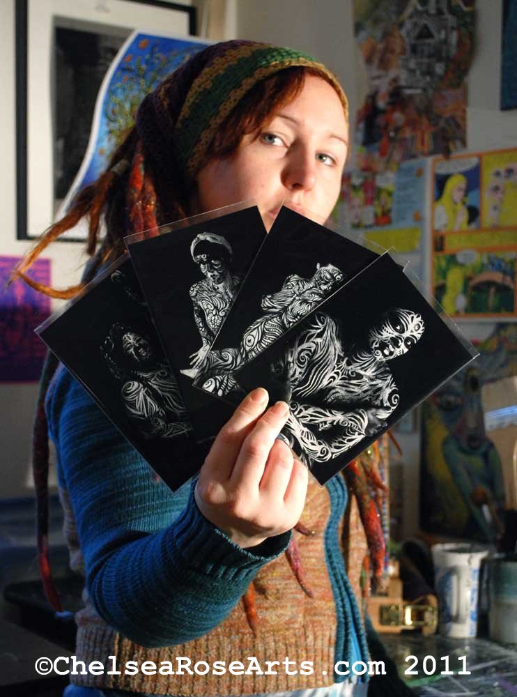
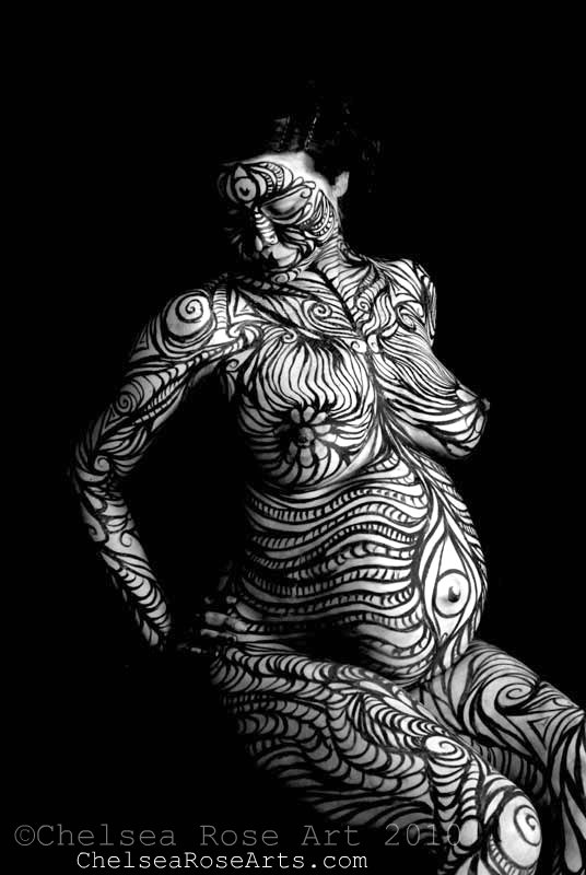
Danny was also busy working on a new art project:

He is hand painting a new screen for a new ebru/screen print project.
This screen will print the outline of this design.
So there is your peak into our messy lil art room.
How was your New Years? What tone and intentions have you set forth?
Much love and many blessings always,
-Chelsea Rose
Lucid Optic Lab


Here's to a new year and messy art spaces!
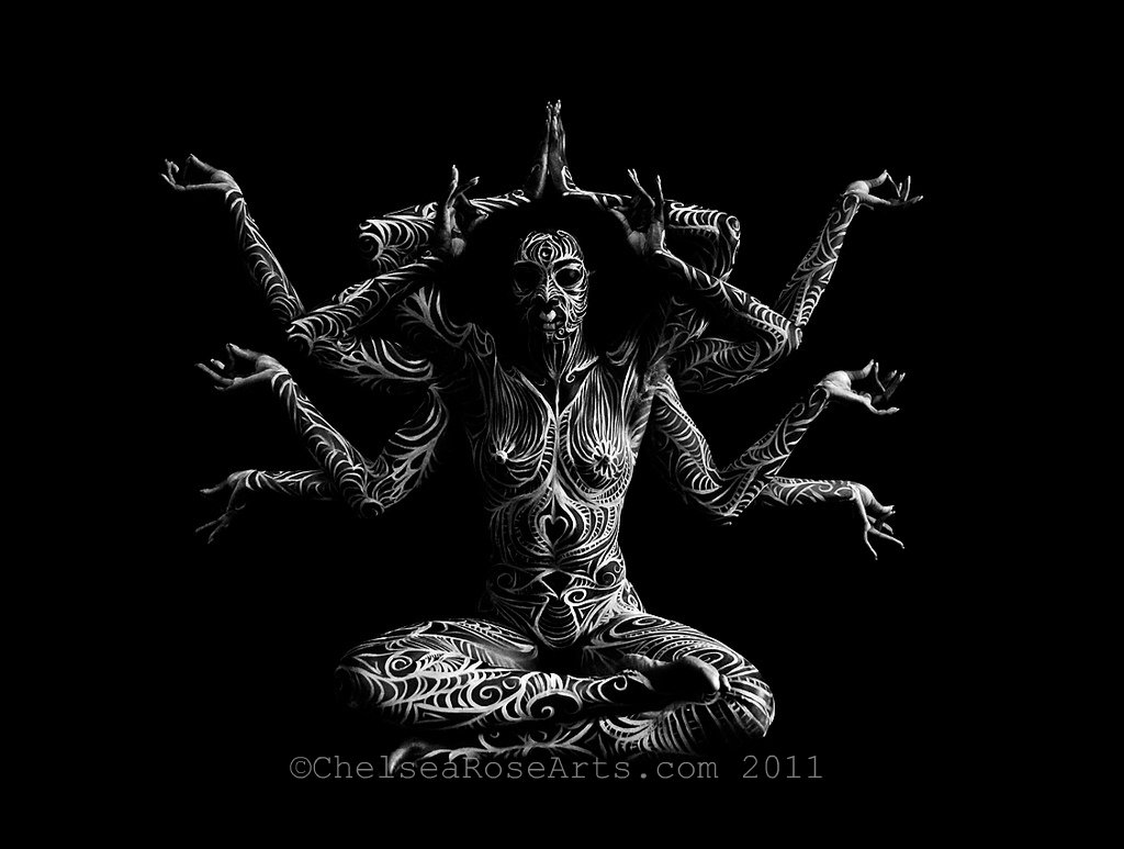
ReplyDeleteAh it looks like Gansesh on that silk screen. Very nice!
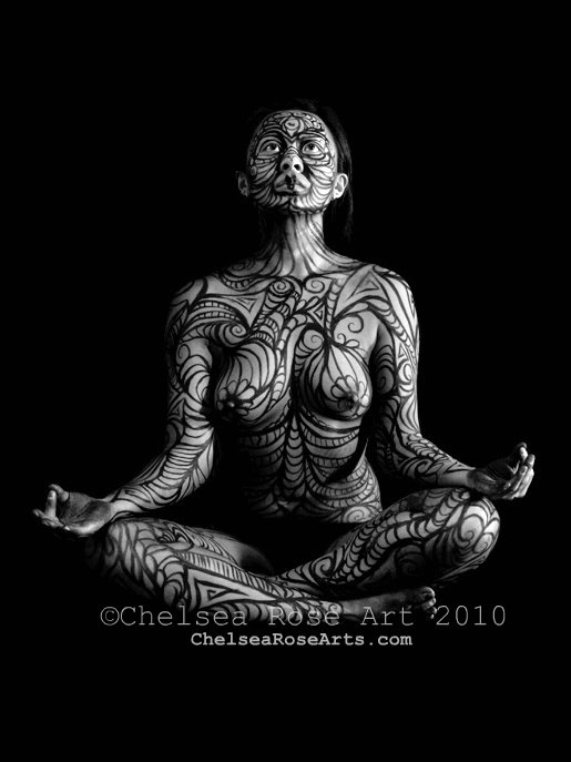
ReplyDeleteChelsea, you know, an idea came to me as I was reading your post. Okay, throw this out with yesterday's bathwater (ewwww), in other words take what you like and leave it all if you wish, but I thought, wouldn't it be beautiful, instead of using the black line around the images, through the images, as you do to define different parts of the body or elements of the painting, if you did something different. Like, perhaps, using a color or colors other that that or dropping it all together. I love the imagery but for me, and again, I apologize because I am a quiet little pisces who loves subtlety, and this is ONLY my opinion, and you know what they say about those - that everyone has one just like everyone has a a$$#%^e, so take it for what it's worth.
I think it would look so COOL if the line, was like a blue-green that morphed into blues and greens (or oranges, golds, luminous fuscias), that contrasted with the elements the defined using values, hues, and tints. I feel that the black weighs some of the pieces down, makes them more harsh, but I do think that sometimes this works for the piece as well, if you want a dramatic and serious tone to the subject matter.
I say this mostly softly to you, as I think you are a VERY talented artist. I am being selfish - it's what I want to see! So it's nothing wrong with your work, just my own wishing : ) BUT, having said that, I think it would make your work even more exciting and dreamy!
Feel free to say I suck. Lol!
Thanks for your great posts, Chelsea. I look forward to them on my blog roll.
Gwen
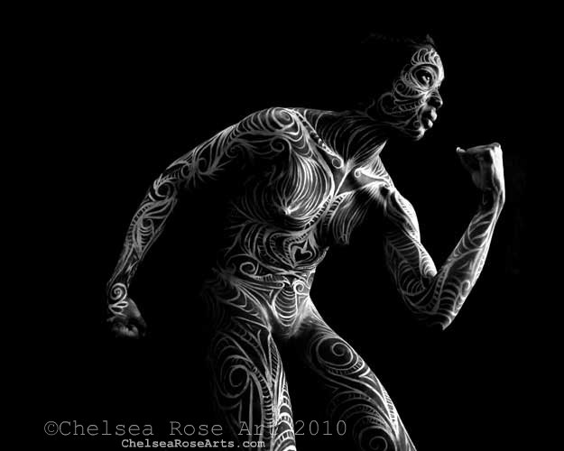
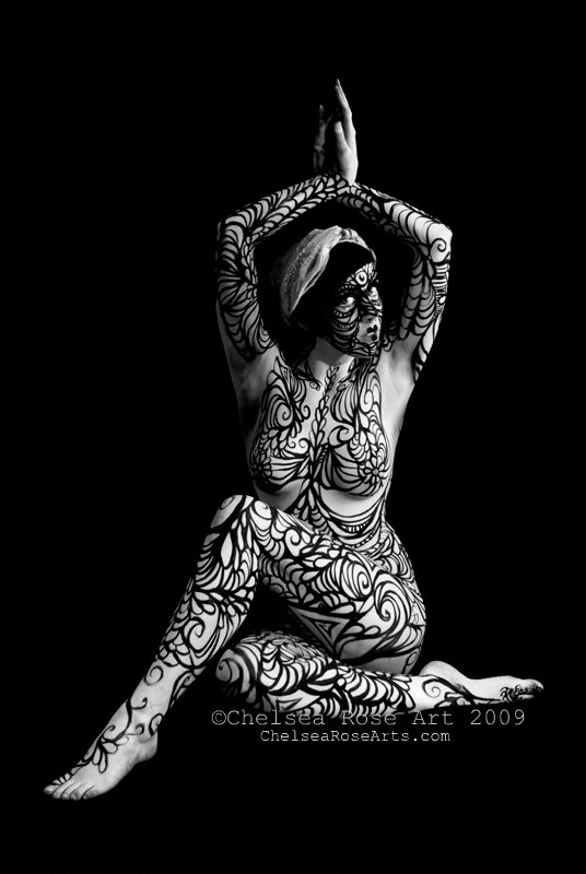
I know that line is a huge part of the body painting, and that works very well!
It's always nice to see new beginnings and
ReplyDeletehear about the hopes of tomorrow!